Short Story
Boston.gov
Or: how can a city government web site truly serve the people?
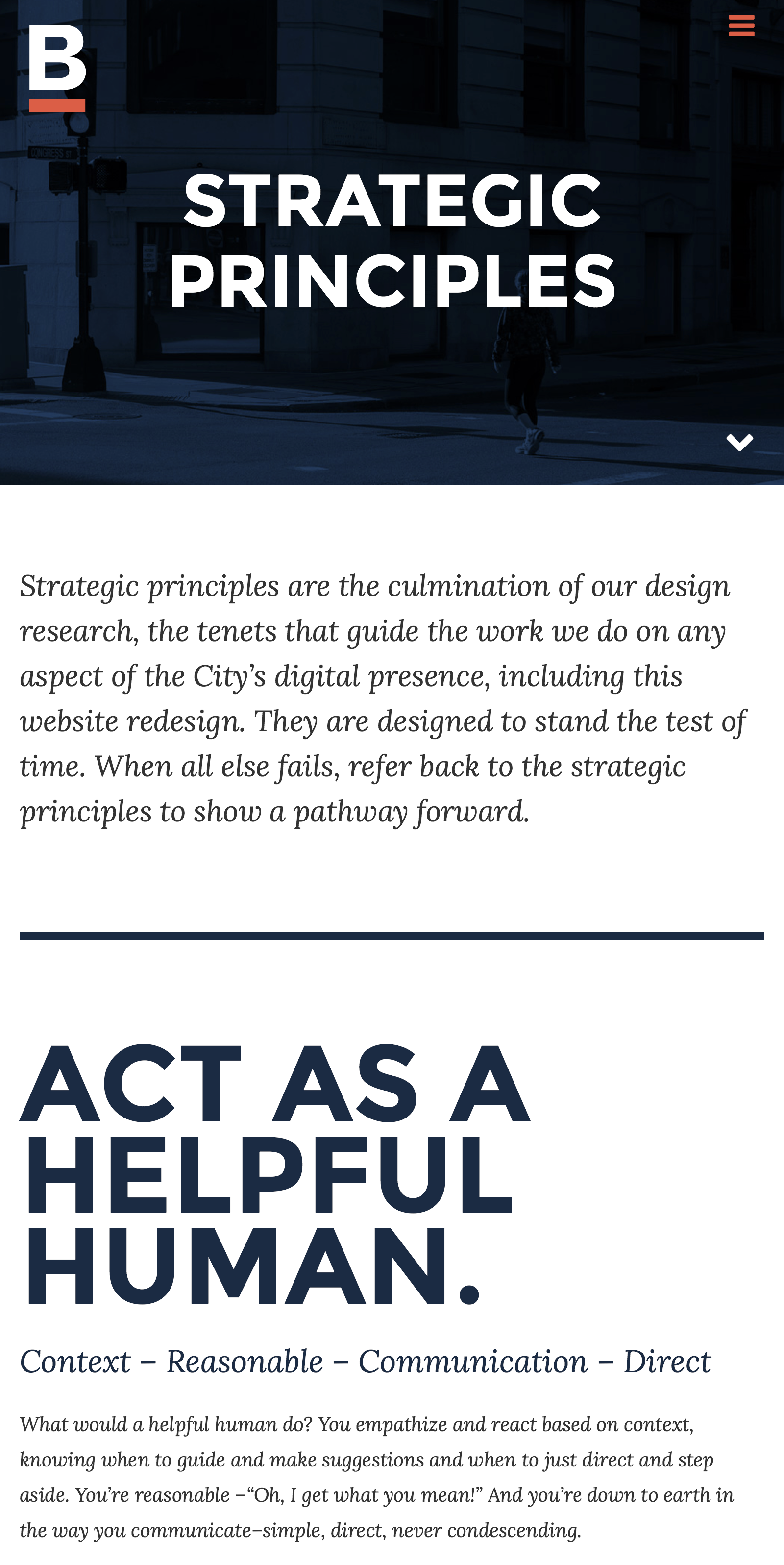
Working with IDEO/Boston, this project entailed the design of a citizen-centric platform for Bostonians. Our initial research unveiled severe I/A and findability problems with the current Boston.gov website. Discovery yielded strategic principles and design direction; wireframes defined a system of components used to make “topic” pages, simple, user-centric presentations of information drawn from across departments, responding to common problems citizens have. A pilot program, a beta launch, and the release of the full site yielded a positive outcome from the city and citizens.
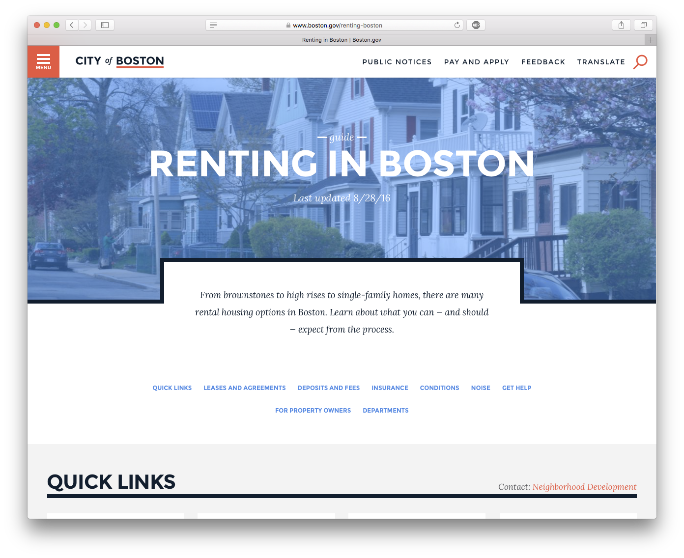
IDEO/Cambridge has done a fantastic case study on Boston.gov , so I'll talk more about my role and contribution here.
Positioning. In addition to the utterly cerebral contribution of "act as a helful human," I helped create the strategic principals based on our research. And I used them as the basis for designing the system of components for our CMS.
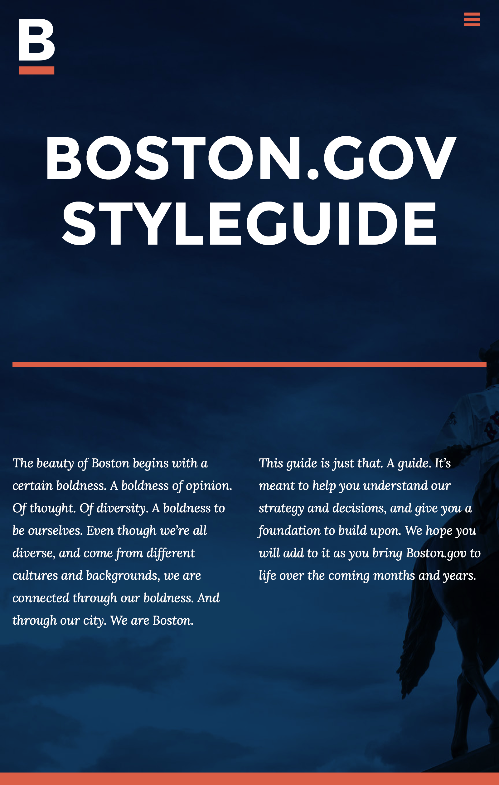
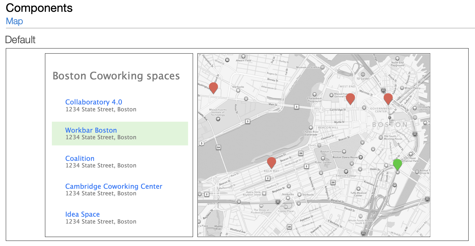
Wireframing and design guidance. I translated needs into components, kicking off an iterative design cycle where we developed a design system and applied it to our model. We then documented all of it into a styleguide that taught the UX vision + how to achieve it.
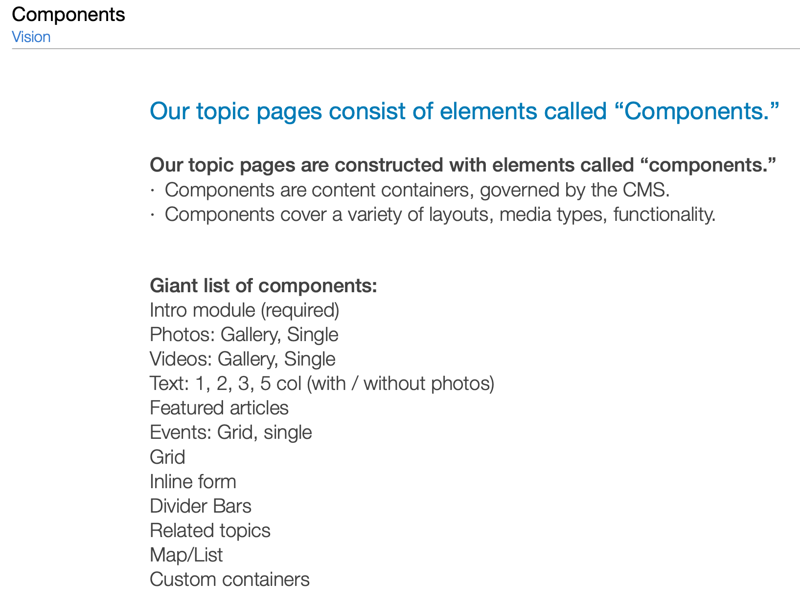
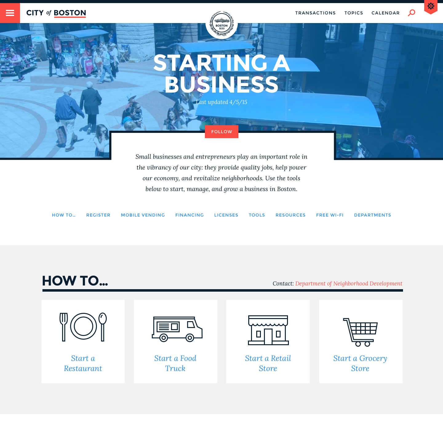
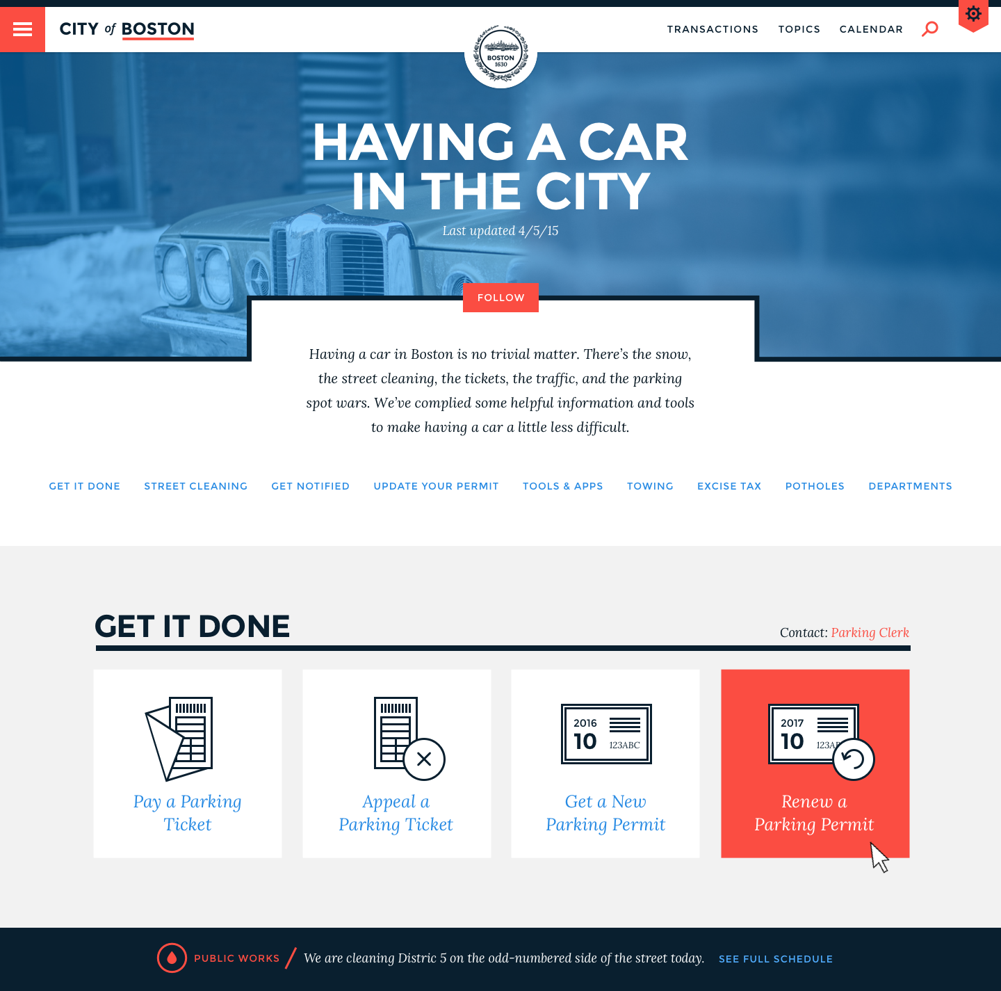
My largest contribution to the project was the vision for the Topic page. With content spread across 50 department sites, each, essentially a microsite with its own navigation, architecture, language, users had no idea where to go for simple or complex tasks Where do I pay my parking ticket online? Is it the Parking Services group? What do I need to do when winter comes to Boston? There are literal fistfights over parking when it snows. Does the same department that handles parking tickets prevent fistfights? Topic pages cut across all of that, organizing content by how a user might think about it, rather than what department it belongs to.
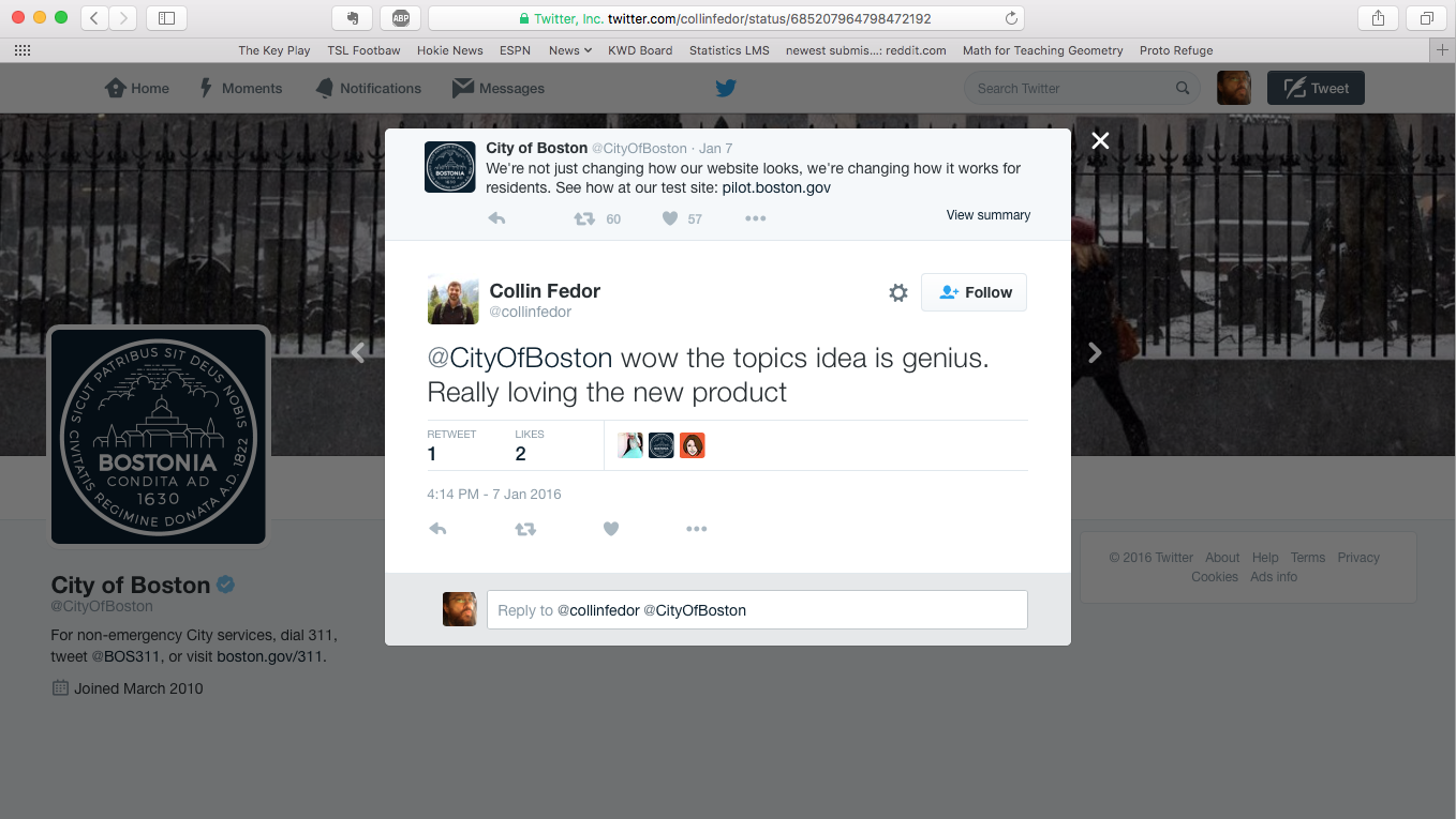
I like to think it helped.
My role: Freelance Consultant, focusing on strategic direction and UX design.
